Purpose
Help people and teams ship digital products with judgment: solid code, intentional design and clear strategy.
A visual and verbal system that defines how the Daniel Jiménez brand looks, sounds and behaves across every touchpoint.
Help people and teams ship digital products with judgment: solid code, intentional design and clear strategy.
Be the go-to freelance reference in Latin America bridging engineering, design and marketing in one voice.
Deliver end-to-end digital products —from idea to deploy— with focus on quality, speed and honest communication.
One person, three disciplines, zero middlemen. From wireframe to production code.
For founders and teams that need to move fast without losing judgment, Daniel is the full-stack freelancer who blends development, design and marketing in a single project.
Early-stage startups, digital SMBs, agencies looking for a technical-creative partner and product teams needing a cross-functional specialist.
Precision, honesty, craft, curiosity, ownership.
Direct, specific, unadorned. Speaks like an expert that doesn't need to prove it.
→ Formal
→ Modern
→ Friendly
→ Precise

Main mark in cerulean blue on dark ground. Preferred use across all communication.
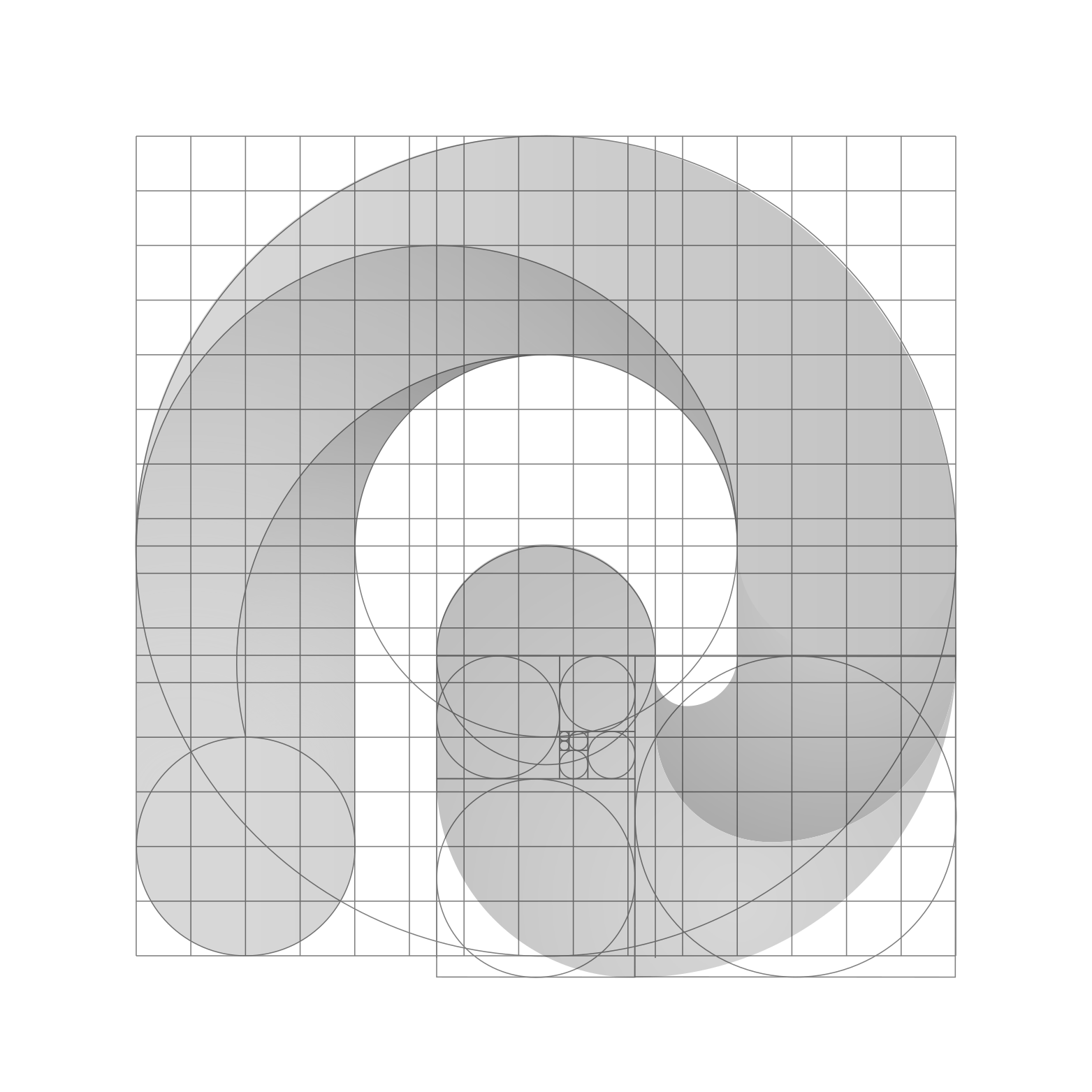
Built on a modular grid with circular arcs and a golden ratio spiral (φ ≈ 1.618) governing the terminal curl.
Always maintain a clear area equal to the height of the mark (x) on all four sides.
24px40px64px96pxMinimum size: 24px in digital, 10mm in print. Always scale proportionally.
Horizontal lockup, isotype and reduced version for favicon and avatars.
Dark backgrounds are preferred. On light backgrounds, use the contrast version.
Pure white on dark grounds; pure black on light. No gradients in mono versions.
Top-left in interfaces, centered on graphic pieces, and as a signature footer on documents.
Do not rotate, distort, add shadows, recolor or break the clear space.
Isotype centered on cerulean background with platform-appropriate rounded corners.
Simplified isotype optimized for 32×32 and 16×16 pixels.
Palette derived from the mark. Cerulean blue anchors the brand; dark tones provide technical depth.
Cerulean Blue
#3AB5E8
RGB 58, 181, 232
Sky Highlight
#7DD4F5
RGB 125, 212, 245
Ocean Depth
#1B7FB5
RGB 27, 127, 181
Midnight Navy
#08101E
RGB 8, 16, 30
Deep Slate
#0E1A2E
RGB 14, 26, 46
Frost White
#E8F0F8
RGB 232, 240, 248
Blue is reserved for CTAs, links and interactive elements. Greys and navys are the ground. Yellow, red and green accents are used sparingly to categorize content.
Primary Typeface
Aa
Gabarito
Gabarito — geometric, confident and distinctly digital. Headlines and display.
ABCDEFGHIJKLMNOPQRSTUVWXYZ abcdefghijklmnopqrstuvwxyz 0123456789 .,:;!?
Secondary Typeface
Aa
Inter
Inter — neutral, readable and functional. Body copy, UI and microcopy.
ABCDEFGHIJKLMNOPQRSTUVWXYZ abcdefghijklmnopqrstuvwxyz 0123456789 .,:;!?
Hierarchy
Display · 64px
Heading 1 · 40px
Heading 2 · 28px
Body Large · 18px
Body · 16px
Caption · 12px
Display 64px · H1 40px · H2 28px · Body Large 18px · Body 16px · Caption 12px. Tighter tracking on large sizes.
Linear icon set, 1.5px stroke, slightly rounded corners. Consistent with the mark geometry.
Patterns based on circular arcs and modular grids. Subtle use as backgrounds or dividers.